If you’re making a 2D game, you’d better start thinking about depth early. If you don’t communicate depth properly, you risk creating a flat-looking game – or worse: you’ll create ambiguous depth that will frustrate the player and distract them from the game.
So, how do you create the illusion of depth in your game? How do you tell the player, visually, that one horizontal plane is above the other?
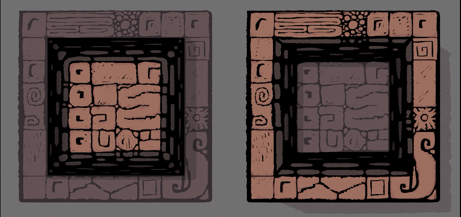
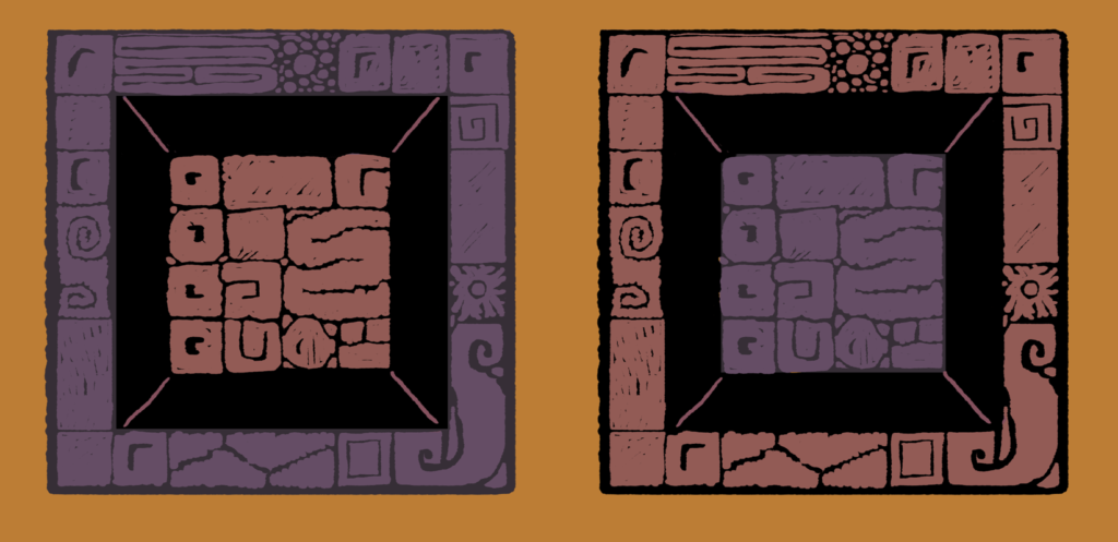
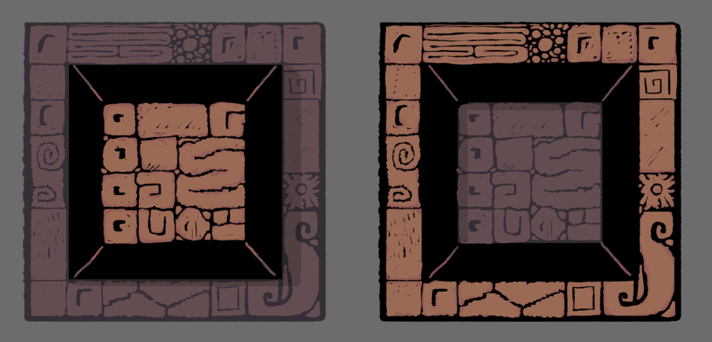
To communicate the fundamental tools of depth management, let’s take the image below:
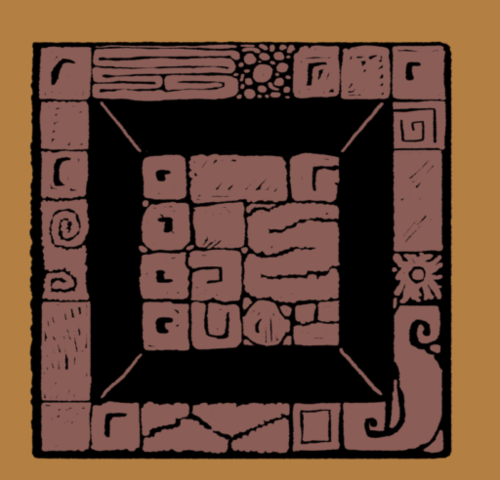
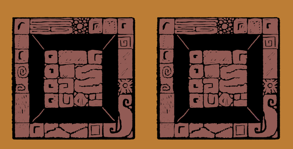
It’s ambiguous. Is it a flat surface with a border of dark tiles, is the center portion raised, is the outer ring raised? No way to tell. We’re going to be taking this image, and showing you, step-by-step, how to make its depth unambiguous. So first, let’s duplicate it:
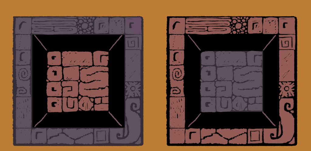
Depth Tool #1: Warm/Cool
Generally, colors get cooler when they go back in space. Warm colors (yellow/red/orange) tend to look closer, cool colors (purple/blue) tend to look farther away. First, I made the background sections cooler – pushing them towards purple.
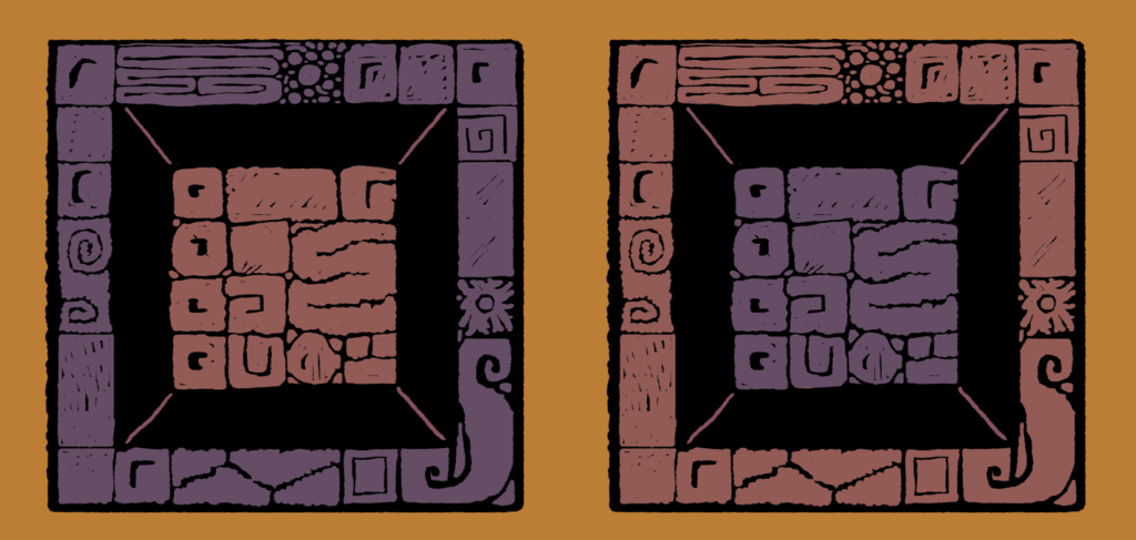
How do you make colors cooler?
Rule of thumb: Push the color more towards blue on the color wheel to make it cooler, push it more towards orange to make it warmer. Desaturate it a bit (push it towards grey) to make it cooler, saturate it to make it warmer.
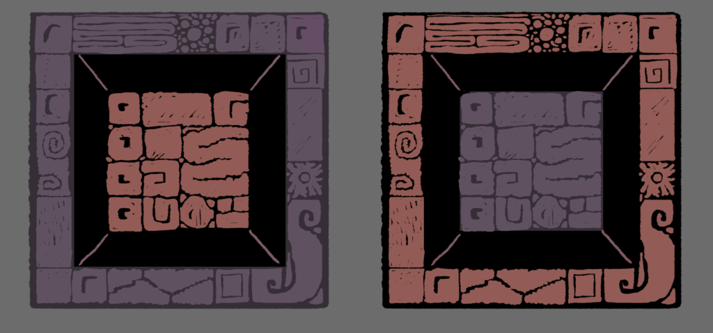
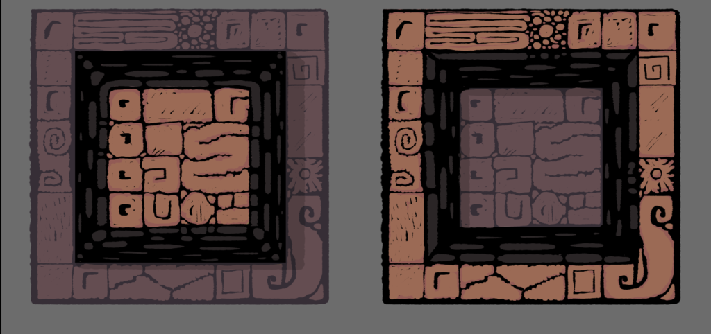
Depth Tool #2: Contrast
Reduce the contrast – the difference between the darks and the lights – in surfaces that are farther away. Higher contrast objects look closer,.
Depth Tool #3: Saturation
Reduce the saturation for objects that are farther away.
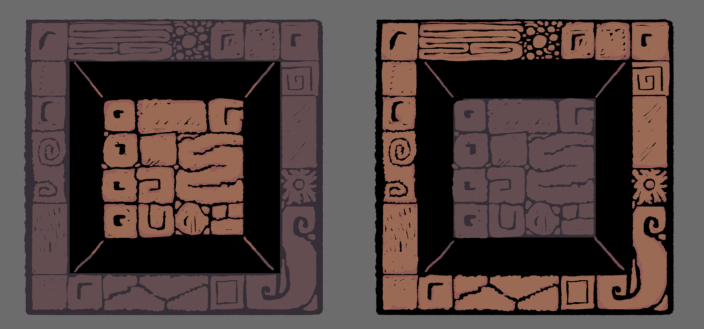
Depth Tool #4: Contrast against background
As objects recede in space, they get closer to the background color – you’ll see this in mountains that are slightly tinted blue by a brilliant blue sky. Tind your background objects a bit like your background, and they’ll fall back in space.
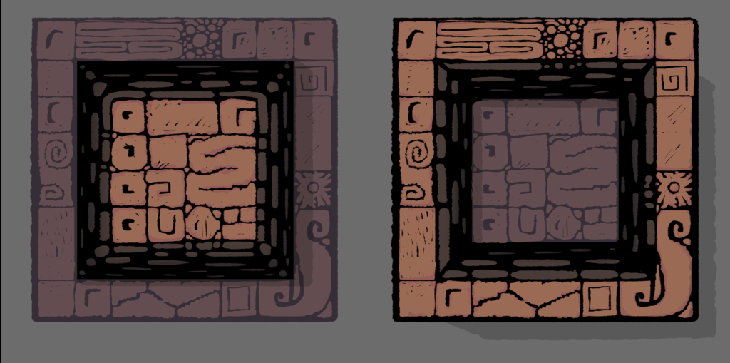
Depth Tool #5: Highlights and details
More details seems to make objects closer, since we can see more detail on objects close to our eye. I also added highlights to increase the sense that light was shining more directly on the foreground objects.
Depth Tool #6: Shadows
Shadows help us see what surfaces are protruding up, and which ones are recessed.
Depth Tool #7: Texture Receding in Space
This is the first point that the line work has changed – I added bricks on thee walls receding into the background.
Depth Tool #8: Lighter going up in space
Here, I added light on the bricks to help accentuate the appearance that they’re going back in space.
Bonus depth tool: Overlap
I didn’t use it here, but obviously objects in the foreground overlap background objects. If you can overlap, use it.
Bonus depth tool: Size
Objects are also larger in the foreground, use size to accentuate the space difference between objects, if you can.
Bonus depth tool: Close objects are sharp, distant objects are blurry
I didn’t utilize this tool in the example above because the player has to be able to walk on all areas of the floor in a top-down game – it doesn’t make since to have some floors be blurry. Remember these tools are only useful in certain contexts. You know your game, pick and choose accordingly. You don’t have to use every one of these tools to create the illusion of depth. Good luck!